We use cookies to offer you a better browsing experience, analyse traffic and personalise content. Read how we use your data in our privacy policy.

Buttons

The classic button, in different colors, sizes, and states

Features

  • Add icons left or right of the text
  • Icon-only buttons
  • Standard and custom colors
  • Five different sizes

  • Full-width style
  • Inverted
  • Outlined

Icons

Icon left, right or icon only - choose from the rich selection of Fontawesome 5
Six icon sizes are available

Link

Setting a link is very easy, just use the standard dialog when clicking the "Link" button.
NEW 1.0.1
  • Omit Link - gives you the option to turn off the link feature. This is required if you use Button in conjunction with the Modal or QuickView Stacks.

Custom Colors

NEW 1.1.5
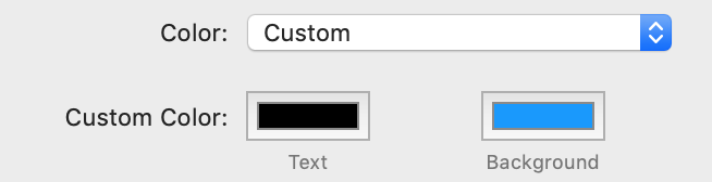
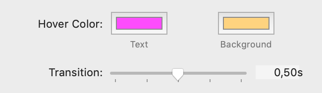
  • Hover Color - gives you the option to choose individual colors for hover text and hover background; works with Outlined option which will use the background color for the outline
  • Transition - sets the time in seconds for the background/outline to change to the hover color

Button Group

Use the Button Group stack if you want to group buttons together on a single line

Button Addons

If you want to use buttons as addons, check the Has Addons option on the Button Group.

Horizontal Alignment

To align a Button Group, use the "left", "center", "right" options
Platform Icon

Made with Platform