We use cookies to offer you a better browsing experience, analyse traffic and personalise content. Read how we use your data in our privacy policy.

Powerbar

A responsive customisable navigation bar

Features

  • Branding with logo and text
  • Can be configured as "sticky"
  • System and custom fonts in branding
  • Custom font sizes in branding
  • System and custom fonts in menus
  • Custom font sizes in menus

  • Left and right side orientation
  • Can be paired with hero stack above or below
  • Custom colors with opacity
  • Customize display of active menu item
  • Individual border style
  • Settings for submenu indicator
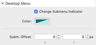
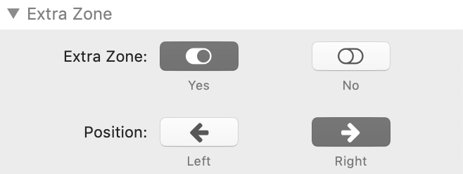
Powerbar is certainly one of the more complex stacks and customising it falls into the advanced category. This is why we encourage you to play with the settings and not get frustrated if things do not look the way you imagine it on the first try.
Keep on keeping on!

Example

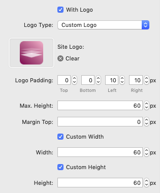
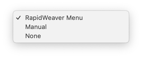
The Powerbar above is an example for a customised navigation bar. It makes use of branding, opacity and the "sticky" feature.

General Settings

  • Menu Orientation - select between Left - i.e. menu on the left, branding on the right - and Right - i.e. branding on the left, menu on the right.
  • Title Pairing - if this is turned on, Powerbar can be paired with a Hero stack.
  • Pairing Position - if Title Pairing is selected, this setting determines whether Powerbar will be positioned above or below the Hero stack.
  • Sticky - select this option to make Powerbar stay anchored to the top of the page while the visitor scrolls. The sticky behaviour starts, once Powerbar has reached the top of the page.
  • Drop Shadow - turns the shadow option on and off.
  • Shadow - enter the X and Y offset (negative values are allowed here, the blur radius and the spread.
NEW 1.0.1
  • Z-Index - gives you the option to control the Z position of PowerBar. Only use this if there is a conflict with another stack

Branding

  • With Branding - turns on or off the entire branding section
  • Title Type - select between Site Title (set in the RapidWeaver General section) or a custom title. Custom Title opens an additional entry field for the site title
  • Title Color - sets the color of the title text
  • Title Padding - fine-tunes the padding around the title text
  • Font Family - provides a section of fonts for the title text. If Custom is selected, the features provided by the Font and Style stacks are available
  • Font Size - sets the font size of the title
  • Font Weight - sets the font weight of the title
  • Text Decoration - provides the text decoration features, such as Underline, Overline, Under- and Overline, Strike-Through
  • Text Transform - select from text transform options, such as Capitalized, Lowercase, Uppercase and Italic
  • Padding Top - sets the distance (padding) of the title from the top.
  • With Logo - if branding is turned on, you can additionally select to display a logo
  • Logo Type - select between RapidWeaver Site Logo (set in the RapidWeaver General section) or a custom log. Custom Logo opens an additional entry field to select a file
  • Logo Padding - fine-tunes the padding around the logo
  • Max.-Height - sets the maximum height for the logo.
  • Margin Top - sets the top margin of the logo (should be left at 0 and only used if Logo Padding does not yield the desired result).
  • Custom Width - opens the custom width field, e.g. for setting special proportions.
  • Custom Height - opens the custom height field, e.g. for setting special proportions.

Additional Information

In the branding section, we are dealing with limited space because we also have to take into account the menu area. This is why parameters such as Title Padding, Font Size, Font Weight and Logo Padding can influence each other.

Breakpoints

The value given here determines at which screen width Powerbar switches to mobile mode. The default value should be acceptable for most cases.

Colors

  • White - sets the color of the menu items
  • Primary - has two color selectors: Normal sets the background color of the entire bar; Dark sets the color of the separator line between the menu header and the actual menu in mobile mode
  • Shadow - has two color selectors: Text sets the shadow color of the main menu text; Box sets the shadow color of the drop-down menu boxes

Main Menu

NEW 1.1.4
Menu Type - there are three menu types available:
  • RapidWeaver Menu - automatically generates the menu structure based on the pages in the project
  • Manual - opens an HTML editor where you can create your menu structure based on an unordered list. Omit the <ul> and </ul> elements as they are added automatically. The example provided in the editor shows all necessary classes and statements
  • None - no menu at all
NEW 1.1.4
  • Remove Links From Parents - this setting will remove links from parent pages so that the parent page will simply be a link to the underlying structure
  • Font Family - provides a section of fonts for the menu text. If Custom is selected, the features provided by the Font and Style stacks are available
  • Font Size - has two entry fields: Base sets the font size of the main menu items; Small sets the font size of the submenu items
  • Font Weight - sets the font weight of the menu
  • Text Decoration - provides the text decoration features, such as Underline, Overline, Under- and Overline, Strike-Through
  • Text Transform - select from text transform options, such as Capitalized, Lowercase, Uppercase and Italic
  • Padding Top - sets the distance (padding) of the main menu from the top.
  • Override Line Height - opens the override line height options
  • Ln.-Height - sets the custom line height in px. Standard is 29.
  • Ln.-Height Subm. - sets the custom line height for submenus (drop-down). Standard is 33.
  • Dividers - toggles the dividers between main menu items.
  • Text Shadow on Mobile - toggles the shadow option for text shadow in mobile mode.
  • Shadow - enter the X and Y offset (negative values are allowed here and the blur radius.

Active Item

  • Underline - underlines the active item in the specified thickness and color
  • Color Indicator - has two color sectors: Normal sets the text color of the active item; Dark sets the background color of the active item
  • Font Style - lets you choose whether to display the active item in bold and/or italic

Borders

These parameters apply to the border around the entire navigation bar.
  • Border Width - sets the border width in px
  • Radius - has two entry fields: Base sets the border radius for the main navigation bar; Small sets the radius for the drop down menu boxes

Desktop Menu

  • Change Submenu Indicator - opens the color selector to change the color of the submenu indicator
  • Subm. Offset - here you can fine tune the position of the drop down menus in X (horizontal) and Y (vertical) direction

Extra Zone

NEW 1.2.3
  • Extra Zone - adds an extra drop zone, e.g. for an icon or a small image
  • Position - sets the position of the element to either the Left or Right on the bar
If you want to completely customise the content of this drop zone, use the standard HTML stack!
Platform Icon

Made with Platform