We are using fairly big images in this example in order to demonstrate the effect of Lazy Loading.
We use cookies to offer you a better browsing experience, analyse traffic and personalise content. Read how we use your data in our privacy policy.


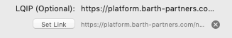
For warehoused images, you can select the Warehoused Image option and provide a link to the image via the standard Link Dialog.
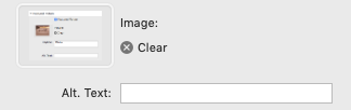
Additionally, you can add an Alternative Text.
Additionally, you can add an Alternative Text.
In non Warehoused Mode you can either browse to the particular picture or drag and drop it onto the image-well. Additionally, you can add an Alternative Text.
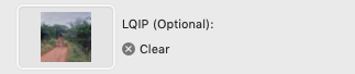
This too applies to the optional LQIP image.
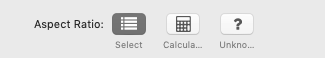
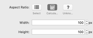
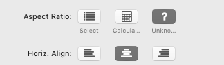
There are three layout options available: Select, Calculated and Unknown. You can use the Width slider on all options to fit the image into the container.
Select
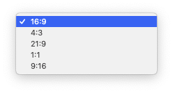
You can select from the available aspect ratios. If the proportions and/or size of the source image do not match the selected aspect ratio, cropping will occur.
You can select from the available aspect ratios. If the proportions and/or size of the source image do not match the selected aspect ratio, cropping will occur.
Calculated
This layout calculates the image dimensions based in the Width and Height values given. If the proportions and/or size of the source image do not match the selected aspect ratio, cropping will occur.
This layout calculates the image dimensions based in the Width and Height values given. If the proportions and/or size of the source image do not match the selected aspect ratio, cropping will occur.
Unknown
This layout analyses the dimensions of the image and provides the container automatically.
It also opens the Alignment options: to align the contents, use the "left", "center", "right" options
This layout analyses the dimensions of the image and provides the container automatically.
It also opens the Alignment options: to align the contents, use the "left", "center", "right" options
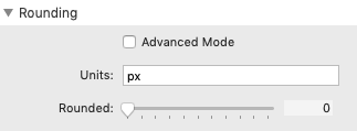
Rounding offers two modes: simple and advanced for more intricate designs.
Simple Mode
- Units - enter the unit type here. Allowed types are the common CSS units
- Rounded - use this slider to set the corner radius
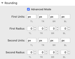
Advanced Mode
This mode provides dual settings for each radius, which are used to define - in order - the horizontal and vertical radii of a quarter ellipse, which in turn determines the curvature of the corner of the outer border edge.
This mode provides dual settings for each radius, which are used to define - in order - the horizontal and vertical radii of a quarter ellipse, which in turn determines the curvature of the corner of the outer border edge.
- Units - enter the unit type here. Allowed types are the common CSS units
- Radius - enter the values to set the corner radii
- Add Shadow - this turns the shadow option on or off
- Shadow - enter the X and Y offset (negative values are allowed here, the blur radius and the spread
- Color - choose a color for the shadow; opacity is supported