We use cookies to offer you a better browsing experience, analyse traffic and personalise content. Read how we use your data in our privacy policy.

Columns

The pillars of Platform

Basics

Building a columns layout with Platform is very simple:

  • Add a columns container with the number of columns you require
  • Set the desired options

Each column will have an equal width, no matter the number of columns.
First Column
Second Column
Third Column
Fourth Column

Column Sizes

Define the size of each column individually

Platform is based on a grid of 12 columns
1
2
3
4
5
6
7
8
9
10
11
12
2
3
4
5
6
7
8
9
10
11
12
3
4
5
6
7
8
9
10
11
12
4
5
6
7
8
9
10
11
12
5
6
7
8
9
10
11
12
6
7
8
9
10
11
12
7
8
9
10
11
12
8
9
10
11
12
9
10
11
12
10
10
11
12
11
11
12

Offset

While you can use empty columns, you can also use the offset parameter.

Size: 6

Offset: 3

Size: 8

Offset: 2

Size: 11

Offset: 1

Size: 4

Offset: 8

Narrow Column

If you want a column to only take the space it needs, use the Narrow option and un-check any size settings. The other column(s) will fill up the remaining space.
This container is 200px wide.
This column will take up the remaining space.

Mobile Layout

By default, columns are only activated from tablet onwards. This means columns are stacked on top of each other on mobile.
If you want columns to work on mobile too, just select Show Columns on Mobile and if required set the Define Mobile Layout option on the particular column.
1
2
3
4

Resize

If you want to see the difference, resize your browser and see when the columns are stacked and when they are horizontally distributed.

Different column sizes per breakpoint

You can define a column size and offset for each viewport size: mobile, tablet, and desktop.
6 Mobile
4 Tablet
3 Desktop
2
3
4

Column Gap

Customize the gap between the columns

Default Gap
Each column has a gap equal to the variable column-gap, which has a default value of 0.75rem.
Since the gap is on each side of a column, the gap between two adjacent columns will be twice the value of column-gap, or 1.5rem by default.
This is a headline
This is a headline
This is a headline
This is a headline
Gapless
If you want to remove the space between the columns, check the Gapless option.
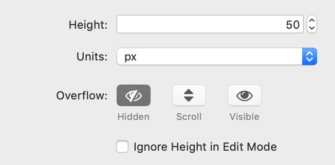
This is a headline
This is a headline
This is a headline
This is a headline

Column Height

Customize the height of the columns
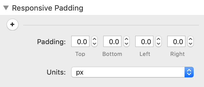
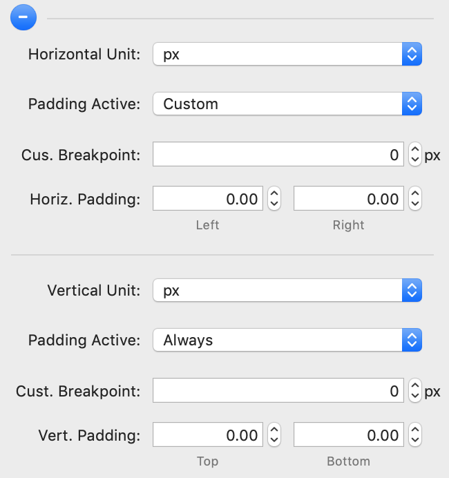
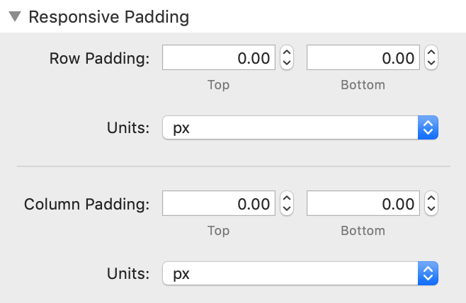
NEW 1.1.3
  • Height - set this to the desired height; the unit of measurement is defined in the setting below; set to "0" for standard height (px, em, rem, %, vh).
  • Units - sets the unit of measurement for the height
  • Overflow - defines how the stack should handle the overflow; setting this to "Scroll" lets the contents be scrolled vertically.
  • Ignore Height in Edit Mode - ignores the height setting in edit mode and sets it to standard; this makes editing the column contents easier; will be ignored in preview and when publishing

Responsive Padding

Different padding for different break points

NEW 1.2.0

1 Column

Simple Mode
  • Padding - Sets the padding for Top, Bottom, Left, Right
  • Units - Select the unit for the padding
Advanced Mode (provides separate padding horizontally and vertically
  • Horizontal Unit - Select the unit for the horizontal padding
  • Padding Active - Select the breakpoint for the horizontal padding or select "Custom" for individual setting
  • Cus. Breakpoint - sets the custom breakpoint (see above)
  • Horiz. Padding - sets the padding Left and Right

  • Vertical Unit - Select the unit for the horizontal padding
  • Padding Active - Select the breakpoint for the horizontal padding or select "Custom" for individual setting
  • Cus. Breakpoint - sets the custom breakpoint (see above)
  • Vert. Padding - sets the padding Top and Bottom

2-6 Column

  • Row-Padding - Sets the row padding for Top and Bottom
  • Units - Select the unit for the paddin
  • Column-Padding - Sets the column padding for Top and Bottom
  • Units - Select the unit for the paddin
Platform Icon

Made with Platform