We use cookies to offer you a better browsing experience, analyse traffic and personalise content. Read how we use your data in our privacy policy.

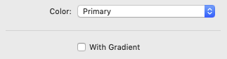
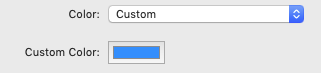
Color
- Standard Colors - select one of the standard colors from the drop down. Additionally the checkbox With Gradient displays the standard color with a standard gradient
- Custom Colors - select Custom from the drop down. This opens a color selector for individual colors
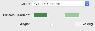
- Custom Gradient - select Custom Gradient from the drop down. This opens two color selectors: one for the starting color and one for the ending color of the gradient. Additionally, you can set the gradient angle via the Angle slider
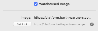
For warehoused images, you can select the Warehoused Image option and provide a link to the image via the standard Link Dialog.
Additionally, you can add an Alternative Text.
Additionally, you can add an Alternative Text.
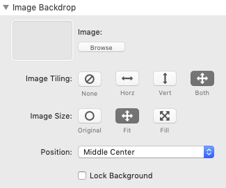
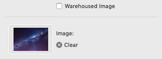
In non Warehouse-Mode you can either browse to the particular picture or drag and drop it onto the image-well.
- Size - you can either browse to the particular picture or drag and drop it onto the image-well.
- Image Tiling - select a tiling option. I you want your image to cover the entire width of the Hero stack, select None
- Image Size - select one of the image sizing options
- Poition - if your image does not completely cover the Hero stack, select one of the Position options to place your image
- Lock Background - choose this option to lock your image. This will create a simple parallax effect when scrolling