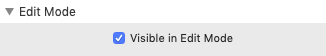
Visible in Edit Mode is turned off by default. If you want to work with the Quickview contents, you must turn this switch on!
We use cookies to offer you a better browsing experience, analyse traffic and personalise content. Read how we use your data in our privacy policy.
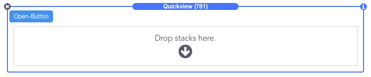
The example provided here uses a Button to open and a Quickmenu inside.
The Quickview stack works as an overlay which in edit mode would be cumbersome to have around all the time. Therefore, you can turn it on and off with this switch.
You can use any stack as the Open Button, such as Button, Icon or Image.
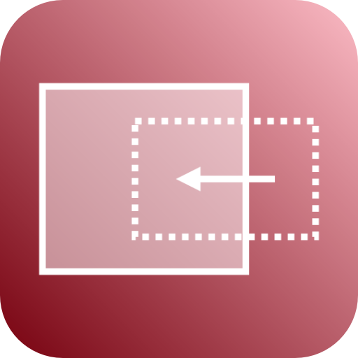
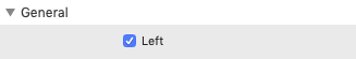
You can have Quickview on the left or on the right side with right being the default.
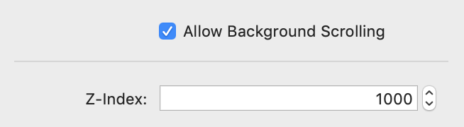
- Allow Background Scolling - this switch allows you to control whether the user can scroll the background while QuickView is active
- Z-Index - gives you the option to control the Z position of Quickview. Only use this if there is a conflict with another stack
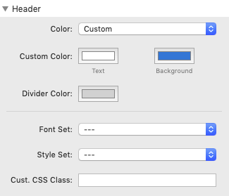
- Color - Besides the standard colors, the Custom option provides color selectors for the header text and the background
- Divider Color - the color of the divider can be set individually
- Font Set, Style Set and Cust. CSS Class - open up the advanced features of the Font and Style stacks
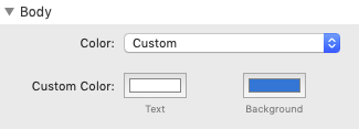
- Color - Besides the standard colors, the Custom option provides color selectors for the body text and the background
- Use this if the stack you are using as the body contents does not provide these settings
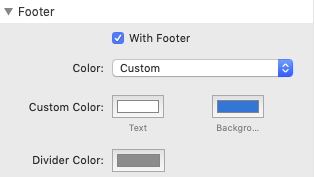
- With Footer - switches the footer area on or off
- Color - Besides the standard colors, the Custom option provides color selectors for the footer text and the background
- Divider Color - the color of the divider can be set individually
If you switch to Visible in Edit Mode, the Quickview stack looks like the example below. You can now
- enter the title
- drop in any stack as the contents of the body
- drop in any stack as the contents of the footer