We use cookies to offer you a better browsing experience, analyse traffic and personalise content. Read how we use your data in our privacy policy.

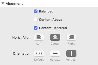
- Balanced - use this setting to make sure that the last step has the same width as the other steps
- Content Above - used to move the steps text above the marker
- Content Centered - used to align the content directly underneath the marker; if this is checked, you can omit Balanced, because Content Centered will make sure the steps are always balanced
- Horiz. Align - determines the alignment of the stack horizontally
- Orientation - has three options: Default - steps are displayed vertically on mobile and horizontally on bigger sizes; Horiz.: steps will always be displayed horizontally; Vertical: steps will always be displayed vertically
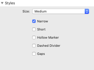
- Size - choose from five different sizes
- Narrow - by default, Steps will take up the entire width. Use this option to only take up as much space as needed
- Short - if set to Vertical, Steps will take up the entire height by default. Use this option to only take up as much space as needed
- Hollow Marker - markers can be styled hollow using this switch. If set here, it will apply to all markers
- Dashed Divider - dividers can be styled dashed using this switch. If set here, it will apply to all dividers
- Gaps - dividers can be styled to have gaps using this switch. If set here, it will apply to all dividers
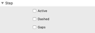
- Active - sets the current active step. Any step before or after the active step will be styled differently
- Dashed - dividers can be styled dashed using this switch. If set on the main stack overrides this setting
- Gaps - dividers can be styled to have gaps using this switch. If set on the main stack overrides this setting
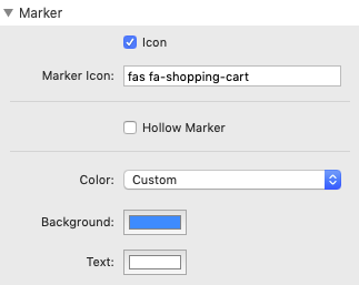
- Icon - opens the entry field for an icon name. Fontawesome 5 is supported
- Hollow Marker - styles the marker hollow with a coloured outline
- Color - Besides the standard colors, the Custom option provides color selectors for the marker text and the background
Title Area
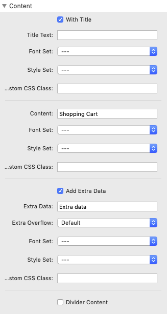
- With Title - enables the optional title section and the related fields
- Title Text - entry field for the title text
- Font Set, Style Set and Cust. CSS Class - open up the advanced features of the Font and Style stacks
- Content - enter the content text here
- Font Set, Style Set and Cust. CSS Class - open up the advanced features of the Font and Style stacks
- Add Extra Data - enables the optional extra data section and the related fields
- Extra Data - entry field for the extra text
- Extra Overflow - select how the overflow of extra text should be handled (default, left, right)
- Font Set, Style Set and Cust. CSS Class - open up the advanced features of the Font and Style stacks
Further global settings are available in the Platform Settings stack.
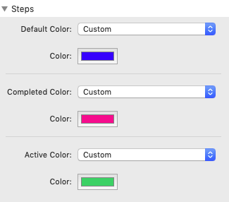
- Default Color - Besides the standard colors, the Custom option provides color selectors for the default color of Markers
- Completed Color - Besides the standard colors, the Custom option provides color selectors for the default color of completed items
- Active Color - Besides the standard colors, the Custom option provides color selectors for the default color of active items